


Grayscale use is encouraged in instances where printing is limited from values of 10 to 90 and used in digital and web platforms from values 100 to 900.
Core Brand Colors
Ithaca College’s core colors are IC blue and IC gold. IC blue is the college’s primary identifying color—it should be present in all official Ithaca College communications.
Supporting Colors for Print, Digital, and Web

Color Use
For most of the college's communications, the campus community should default to IC's primary colors, using IC blue with gold accents.
The supporting colors should only be used on items produced by MarCom, with few exceptions. When using supporting colors for high-visibility materials, we use the guidelines below as a starting point to consider color proportions. The specific audience we are communicating with is a key factor in determining how we use our color palette. The content, tone, and audience of the piece also inform color choice.
Prospective Students
We use the supporting colors in larger proportions to create energy, vibrancy, and boldness, especially in longer pieces (such as booklets). IC blue should be present as a through line in every piece.

Current Students and Campus Community
We emphasize institutional pride and connection by using a stronger presence of the core brand colors and the supporting blues. Bold colors from the supporting palette add energy and vibrancy.

Alumni
We use our primary brand colors with a strong presence of IC blue to reinforce a sense of institutional pride, connection, and familiarity. We use supporting colors—especially the supporting blues—to create energy and add variety.

Color Combinations
For most college communications, the campus community should default to IC's primary colors, using IC blue with gold accents. For items created through MarCom, we use the combinations and proportions shown as a starting point.

Accessible Color Combinations
To ensure our communications are inclusive and legible for everyone, we've curated a set of accessible color combinations. These pairings meet Web Content Accessibility Guidelines (WCAG) 2.1 Level AA standards for contrast.
Text on Color Combinations
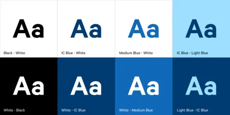
Use these recommended combinations for standard body text on color backgrounds.
Note on Usage: Always test color combinations using accessibility tools like the WebAim Contrast Checker. These approved combinations cover most use cases, but when creating new layouts, verification is essential.
Color Combinations to Avoid
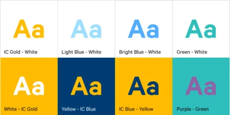
Avoid the following color combinations for text as they detract from user experience, reduce readability, and fail to meet accessibility standards and best practices. This includes pairing our core IC blue with IC gold, which is reserved for specific brand elements only.
Note: Always test color combinations using accessibility tools like the WebAim Contrast Checker.