Card: Stat

A bold card built around a single key number, pulled from a managed list of statistics.

Understanding the Card: Stat

Example of the "Card: Stat" component

The Card: Statistics highlights one important number, such as a graduation rate or an average financial aid offer. The number and its labels are not typed in by hand. Instead you pick a statistic from a managed list, and the card displays it in a large, bold format. You can add an optional icon and an optional link. Like every card, it lives inside a Collection: Card Grid and sits alongside up to two other stat cards in a row.

Two things set the stat card apart. Its content comes from a shared list of statistics rather than free text, and its color is chosen once for the whole collection rather than per card.

When to use a Card: Statistics

Reach for a Card: Statistics when a number is the point and you want a few of them to stand together. Good use cases include:

  • Admissions or enrollment figures, such as student-to-faculty ratio
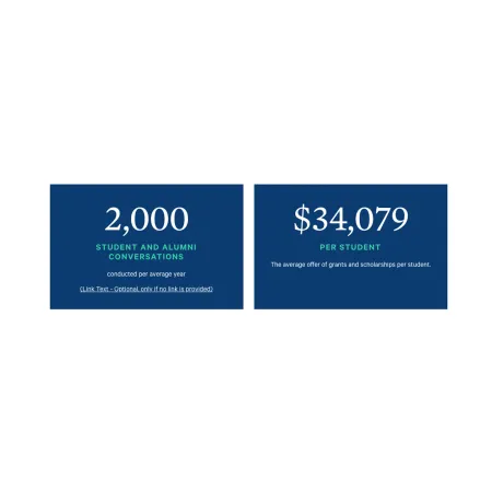
  • Financial aid figures, such as the average grant or scholarship offer
  • Outcomes, such as job or graduate school placement rates

If you need to write your own title and description rather than use a managed number, the Card: Info or Card: Text is a better fit. If a photo should lead the card, use the Card: Image.

Where the statistics come from

The numbers and labels shown on a stat card are managed by the Office of Marketing Communications, not entered on the card itself. You only choose which statistic to display. If a statistic looks out of date or you need one that is not in the list, contact Marketing Communications to have it updated or added.

Adding and modifying a Card: Stat

Inside a Collection: Card Grid, click "Add Collection: Statistics" to add a card, then fill in the fields below. You can add up to three stat cards, and reorder them with the drag handle on the left of each card.

Collection Heading (optional)

The Collection Heading is the title displayed above the row of cards. Keep it short and descriptive, up to 60 characters.

Subheading (optional)

The Subheading is a short supporting line displayed beneath the Collection Heading, up to 130 characters. 

Card Color (required)

The Card Color sets the background color for the whole collection, chosen from the dropdown: Dark Blue and White. Because it is set on the collection, every stat card in the group shares the same color.

Statistic (required)

The Statistic is the number displayed on the card, chosen from the dropdown. The dropdown holds the statistics maintained by Marketing Communications, and selecting one fills in the number and its labels automatically. There is nothing to type here.

Icon (optional)

The Icon is an optional image displayed on the card. Upload a single file to add one. This option is restricted to Administrators.

Link (optional)

The Link is optional. If you add one, it appears at the bottom of the card.

  • URL: Enter an internal path such as /node/add, or start typing the title of an existing page to search for and select it.
  • Link text: The visible text for the link. Add this only if you have entered a link.
Looking for an example?

This component isn't available on standard pages. See it in context on the Topic Demo page of the Web Content Demo.