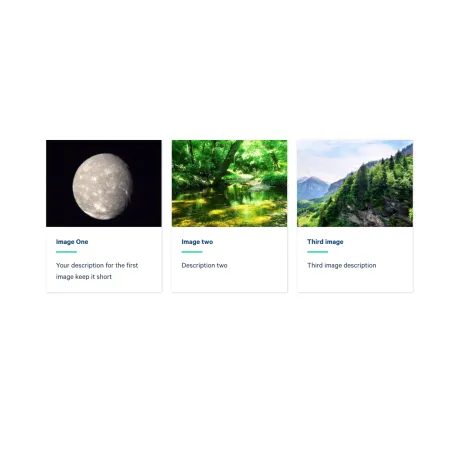
Inside a Collection: Card Grid, click "Add Collection: Image" to add a card, then fill in the fields below. You can add up to three image cards, and reorder them with the drag handle on the left of each card.
Collection Heading (optional)
The Collection Heading is the title displayed above the row of cards. Keep it short and descriptive, up to 60 characters.
Subheading (optional)
The Subheading is a short supporting line displayed beneath the Collection Heading, up to 130 characters. It only appears when you have entered a Collection Heading.
Image (required)
The Image is the featured photo at the top of the card. Upload an image and add Alternative text, a short description that screen readers announce and that displays if the image does not load. For help choosing, sizing, and cropping images, and for writing good alternative text, see the Working with Images guide. The image works the same way as the standalone Media: Image component.
Card Title (required)
The Card Title is the bold heading shown beneath the image, up to 40 characters. Keep it short and scannable, such as the program name or location.
Description (required)
The Description is a short line of supporting text below the title, up to 130 characters. Use it to add context the title alone does not convey.
Link (required)
The Link is where the card points when readers click it.
- URL: Start typing the title of an existing page to search for and select it, or paste an internal path or a full external web address such as https://www.ithaca.edu.
- Link text: The visible text for the link, such as "Learn more" or "Explore the program."
Choosing The Link Style
How the link is displayed, whether the whole card is clickable, a text link, or a button, is chosen once for the entire collection by the Link Style field, so every card in the group links the same way.
- Card Link makes the entire card a clickable link.
- Text Link adds a link at the bottom of each card.
- Button Link adds a button at the bottom of each card.
To have link-less cards, pick the Text Link style and utilize the <nolink> tag, as described in Working with Links.