The Card: Text is the simplest card type. Each card has a title and a short description, with no image or button, and the entire card acts as a single clickable link. Each card can also be given its own background color. Like every card, it lives inside a Collection: Card Grid and sits alongside up to two other text cards in a row.
The main difference from the Card: Info is how it links. A text card has no button. Instead the whole card is clickable, so it reads as a clean block of text rather than a call to action.
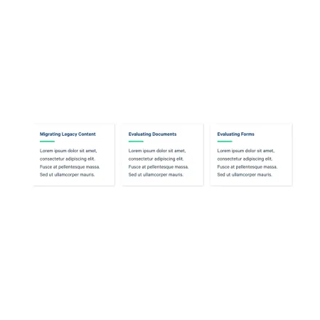
When to use a Card: Text
Reach for a Card: Text when you have a set of short, parallel topics that each lead somewhere, and a photo or button would only get in the way. Good use cases include:
- Quick links to related guides or resources, such as "Migrating Legacy Content" or "Evaluating Documents"
- A set of program or department highlights, each linking to its own page
- Topic overviews where the title and a sentence are enough to orient the reader
If you want a prominent button instead of a clickable card, the Card: Info is a better fit. If a photo should lead the card, use the Card: Image.