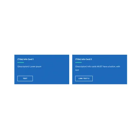
The Card: Info is the most prominent card type. Each card has its own solid background color, a title, a short description, and a button, making it well suited to grouped calls to action. Like every card, it lives inside a Collection: Card Grid and sits alongside up to two other info cards in a row.
Two things set the info card apart from the others. Every info card always displays a button, so a link is required on each one, and each card can be given its own color rather than sharing a single style across the group.
When to use a Card: Info
Reach for a Card: Info when you want a set of bold, clearly clickable actions side by side. Good use cases include:
- Calls to action such as "Apply Now," "Request Info," and "Schedule a Visit"
- Key next steps for prospective students, each linking to the relevant page
- Important quick links you want to stand out with color and a button
If you want the whole card to be clickable instead of showing a button, the Card: Text is a better fit. If a photo should lead the card, use the Card: Image, and if a single number is the point, use the Card: Statistics.