Accordion

Collapsible content sections to consolidate text sections.

Understanding Accordions

Example image of the Accordion component/paragraph

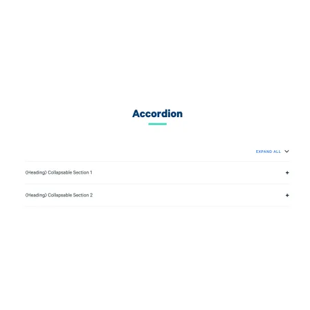
An accordion is a UI component that shows a list of items, each with a title and hidden content. Users click a title to expand it and reveal the content beneath. Only one (or sometimes a few) sections are open at a time, keeping the page tidy and reducing scrolling.

When to use an accordion

Accordions work well when you have several related pieces of content that not every visitor needs to read in full. Good use cases include:

  • Frequently asked questions (FAQ) pages
  • Program or course details where users are likely looking for one specific thing
  • Step-by-step processes where each step has detailed sub-content
  • Content with natural sections that are self-contained, like department policies or event details

Avoid using an accordion if most users will need to read all of the content, or if the content is short enough to read comfortably as a single page. Hiding content adds a step for the user, so it should only be used when it genuinely helps them navigate.

Sharing a link to a specific accordion section

When a visitor expands an accordion section, the page URL automatically updates to include an anchor that points directly to that section. For example, a URL might change from ithaca.edu/faq to ithaca.edu/faq#tuition-and-fees. Click here to open the "Example 2" section.

This means you or your visitors can copy the URL from the browser address bar while a section is open and share it with others. Anyone who follows that link will be taken directly to the page with that section already expanded, rather than having to scroll and find it themselves. This is especially useful when directing students or colleagues to a specific piece of information.

Adding and Modifying Accordions

Section heading and intro text

At the top of the accordion component, you can optionally add a heading and intro text that appear above all the expandable sections. These are useful for giving the accordion context, such as a title like "Frequently Asked Questions" or a brief sentence explaining what visitors will find below. Both fields are optional and can be left blank.

Adding sections

Each expandable item in the accordion is called a collapsible text block. Click "Add Collapsible Text" at the bottom of the component to add a new section. Each block has two fields:

Text Heading (required): 
The title that is always visible and that users click to expand the section. This might be a question, a topic name, or a category label. Only basic formatting like italics is supported here.

Text (required): 
The content revealed when the section is expanded. This field supports full rich text editing, including bold, italics, links, lists, and tables.

Reordering sections

You can change the order of your accordion sections at any time by dragging and dropping them. Each section has a drag handle on its left side (the up/down arrow icon). Click and hold that handle, then drag the section to its new position.

Showing a "Last Updated" date

Each section has an optional "Last Updated" field. Check the "Last Updated" checkbox on a section to display the date that content was last updated to visitors. The "Updated Date" field below it defaults to today's date, but you can change it to reflect when the content in that specific section was actually last revised. This is particularly useful for policy pages or any content that changes periodically and where visitors benefit from knowing how current the information is.

Supported content types:

  • Sites,
  • programs,
  • departments,
  • topics,
  • landing pages,
  • person spotlights,
  • news articles,
  • IC View articles,
  • blog posts,
  • profiles
  • and pages.

Accordion Example

Accordions allow for optional headings and intro text.

When expanded, accordions show additional, rich text. 

  • Lots of the features you expect when editing text are available, such as:
    • Bulleted lists,
    • Bold text,
    • Italicized text,
    • Hyperlinks,
    • and more!

When expanded, accordions show additional, rich text. This section has the "Last Updated" toggled on, thus displaying a date.