Feature pre-made Person Spotlight stories in a grid, slider, or gallery.

Understanding Spotlights

Example of the "Spotlight Gallery" component / paragraph

Example of the "Spotlight Gallery"

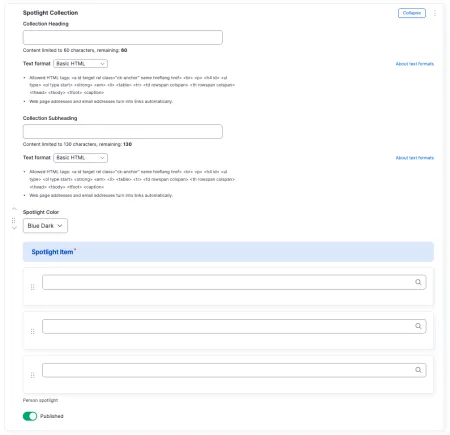
Spotlights are a family of components that feature the Person Spotlight stories produced by Marketing Communications, the same profiles highlighted on the People and Progress page. Each spotlight is a short, pre-made story about a student, faculty member, alum, or other member of the IC community.

When you add a Spotlight component, you are not writing the story yourself. You are choosing which existing spotlights to feature and how they should appear on your page. Because the stories are pre-made, the parts that show on each card are controlled by the linked spotlight, not by you. The card image, the card copy, the name (shown as the title), and the subtitle all come from the spotlight itself, and the button text is set to a default. Your job is to pick the spotlights, arrange them, and choose how the group is framed.

There are four Spotlight components to choose from. They all reference the same pre-made stories. They differ in how those stories are displayed and how many you can include.

When to use a Spotlight

Reach for a Spotlight component when you want to point visitors toward people-focused stories that Marketing Communications has already produced. Good use cases include:

  • Showcasing alumni or student success stories on a program or department site
  • Adding a section of community profiles to a topic or custom landing page
  • Featuring faculty achievements alongside related content

Avoid using a Spotlight component for content you have written yourself, or for stories that do not already exist as Person Spotlights. If you want to highlight your own written content with an image and a link, a Callout is usually a better fit.

Choosing a Spotlight Component

The Spotlight Collection displays your chosen stories as a grid of cards, each with an image, a short teaser, and a button. A single collection holds three spotlights. You can stack more than one collection on a page if you want to feature additional groups.

The background color of the Spotlight Collection can be set to dark blue, or white. Choose the color that best fits the surrounding content and keeps the spotlights readable against the rest of the page.

Spotlight Collection is available on:

  • sites,
  • academic programs,
  • academic departments,
  • topics,
  • and custom landing pages.

The Single Spotlight Slider is a carousel that puts the focus on one spotlight at a time, with arrows and dots for moving between them. A single slider holds up to five spotlights.

Single Spotlight Slider is available on:

  • sites,
  • topics,
  • custom landing pages,
  • person spotlights,
  • news articles,
  • academic programs,
  • and academic departments.

The Multi Spotlight Slider is a carousel that shows several spotlights at once, with one brought into focus as visitors scroll through. It needs at least four spotlights so the carousel has enough to rotate through.

The background color of the Multi Spotlight Slider can be set to light blue, dark blue, or white. Choose the color that best fits the surrounding content and keeps the spotlights readable against the rest of the page.

Multi Spotlight Slider is available on:

  • custom landing pages

The Spotlight Gallery presents your stories as a set of browsable thumbnails with names. It holds exactly three spotlights, and it only works on full-width pages such as the homepage.

Spotlight Gallery is available on:

  • custom landing pages

Adding and modifying Spotlights

Example of the interface to modify a Spotlight Collection

To add a story, use the search field for each Spotlight Item and start typing a person's name. Matching Person Spotlights will appear for you to select. To change the order in which stories appear, use the drag handle on the left side of each item and drag it up or down.

The heading and subheading introduce the group of stories and have character limits to keep them readable. For example, the heading might read "Spotlights: The Ithaca College Story" with a short subheading inviting visitors to meet community members who took risks, embraced setbacks, and found their way to success.

Remember that everything inside each card comes from the linked spotlight: the image, the copy, the name, the subtitle, and the button. If a story's wording or image needs to change, that change happens on the spotlight itself, not in this component. Reach out to Marketing Communications for edits to a spotlight's content.