Callout

A prominent box for important information.

Understanding Callouts

Example image of the Callout component/paragraph

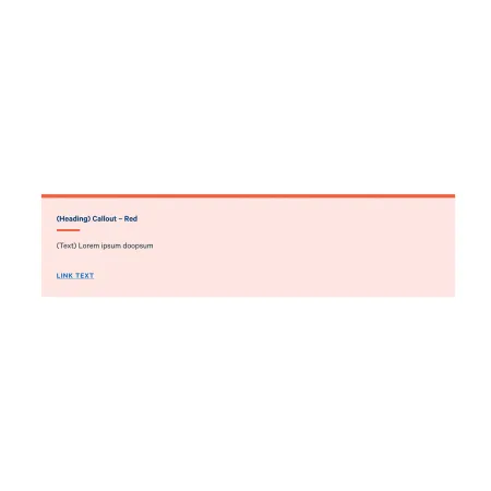
A callout is a visually distinct box that draws attention to a specific piece of content on the page. It uses a colored background and bold styling to stand out from the surrounding body text, making it useful for highlighting information that visitors should not miss.

When to use a callout

Callouts work best when you have a single piece of important information that needs to stand out from the rest of the page. Good use cases include:

  • Application deadlines or other key dates
  • Required prerequisites or quick reference information
  • A key takeaway from a longer page of content
  • A call to action, such as "Apply now" or "Request information"
  • Alerts about changes, updates, or items visitors are likely to overlook

Avoid using callouts for content that is not genuinely important or time-sensitive. The more callouts you place on a page, the less each one stands out, and visitors begin to scroll past them. As a general rule, one callout per page is plenty. Two should be the maximum, and only if they cover clearly different topics.

If your callout is specifically for contact details, the Contact Callout component is a better fit. If the information you want to highlight is longer than a couple of sentences, consider whether it belongs in regular body text, an Accordion, or a Card instead.

Adding and Modifying Callouts

Heading (required)

The Heading is the bold title displayed at the top of the callout. Keep it short and direct so visitors understand the point at a glance. A few words is usually enough.

Text (required)

The Text field is the main body of the callout. For more information on how to effectively use the WYSIWYG editor, visit the documentation for the Text Paragraph

Keep callout text brief. The purpose of a callout is to draw attention to a specific point, not to host long-form content. One to three sentences is typical. If you find yourself writing several paragraphs, that content most likely belongs in regular body text instead.

Link (optional)

You can add an optional link at the bottom of the callout to direct visitors to a related page or resource. Start typing the title of an existing piece of content in the URL field to select it from the autocomplete suggestions, or enter an alternative full URL.

The Link text field is where you enter the words visitors will see and click. Use clear, descriptive language that tells visitors where the link will take them. "View application requirements" works much better than "Click here." If you leave the Link section blank, no link will appear on the published callout.

Supported content types:

  • Sites,
  • topics,
  • pages,
  • categories,
  • academic programs,
  • academic departments,
  • blog posts,
  • custom landing pages,
  • IC View articles,
  • news articles,
  • profiles,
  • and person spotlights.
Alternative Card Colors

Gray is the neutral default and is appropriate for most general use cases, though Yellow and Red options are available to CMS Managers and Administrators. 

Yellow and Red are reserved for content that needs additional urgency or warning, such as a deadline update or notice about a policy change.

This is a callout!