Image (required)
The Image is the full-width background photo for the banner. Click "Choose File" to upload an image from your computer. Only one file is allowed, with a 10 MB size limit, and accepted file types are PNG, GIF, JPG, JPEG, and WEBP. The image must have a minimum width of 912 pixels so it stays sharp across the full width of the page.
Choose a high-quality, horizontal photo that still reads well behind the content card. After uploading, you will be prompted to add alternative text.
CTA Intro Header Shape Options (optional)
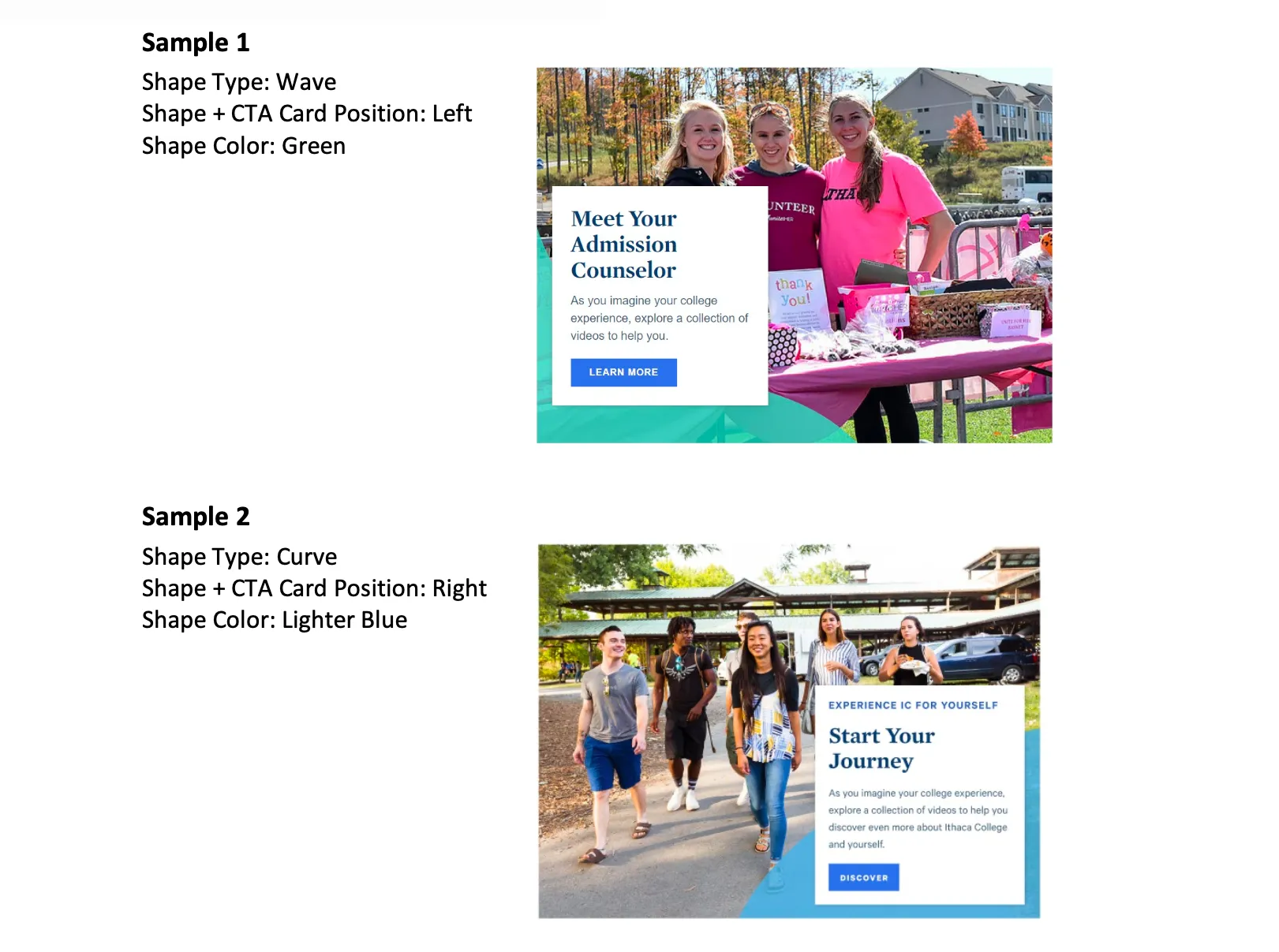
This group of settings controls the decorative shapes that frame the content card. The shapes are purely visual, so choose options that suit your page's look rather than to convey information. There are three dropdowns:
- Shape Type sets the style of the accent shape. Choose from Angle, Wave, or Curve.
- Shape Color sets the color of the accent shape and card detailing. Choose from Blue Dark, Blue Bright, Blue Lighter, Gold, Green, or Purple.
- Shape & CTA Card H Position controls whether the content card and shapes sit on the Left or Right side of the banner.
Intro Heading (optional)
The Intro Heading is the large, bold title displayed on the content card. This is the main message of the banner, so keep it short and direct, for example "Start Your Journey" or "Explore Communications." You can italicize a word for light emphasis. The heading is limited to 60 characters.
Intro Subheading (optional)
The Intro Subheading is a short line of text that appears above the heading, styled as a small uppercase label (often called an eyebrow). Use it to set context for the heading, for example "Undergraduate Admissions" or "School of Music." It is limited to 30 characters.
Intro Text (optional)
The Intro Text is a brief supporting sentence that appears below the heading. Use it to add one short, welcoming detail that builds on the heading. The Intro Text field supports rich text editing; see the {LINK TO (Text)} component for the full list of formatting options. It is limited to 150 characters, so it is meant for a single concise sentence rather than a paragraph.
Intro Link (optional)
The Intro Link creates the call-to-action button on the card. It has two parts:
- URL is where the button leads. Start typing the title of a page on ithaca.edu to search for and select it, or paste an internal path or a full external web address.
- Link text is the wording shown on the button itself, for example "Apply Now," "Request Information," or "Visit Campus." Keep it short and action-focused.
The button only appears when both fields are filled in. While only the Image is required, a Hero: Primary is most effective with a heading and a link in place.
Supported content types:
- sites,
- academic programs,
- and academic departments.