Style (required)
The Style dropdown at the top of the component controls how your buttons look. Choose Solid Buttons for filled buttons that stand out strongly against the background, or Transparent Buttons for outlined buttons with a see-through fill, which let more of the background image or video show through. This setting applies to every link in the component, so all of your buttons share the same style.
Background image (optional)
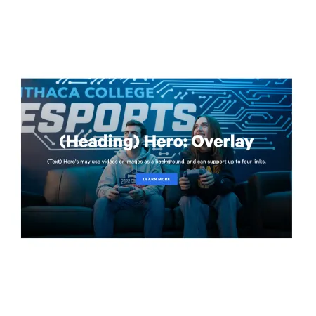
The Background Image sits in the Hero Background section and fills the entire banner. Click "Add new media item" to choose an image from the media library or upload a new one. The heading, text, and buttons display on top of this image, so pick a photo with enough open or darker space for that content to stay readable. See the Working with Images guide for sizing and upload help, and the Creating Accessible Web Content guide for keeping overlaid text legible.
A background image is optional. You can add an image, add a video instead, or leave both empty for a plain banner.
Background video (optional)
The MP4 Background Video field lets you use a short video as the banner background instead of a still image. Add an MP4 file in the Hero Background section, and it will play behind your heading, text, and buttons. Keep videos short and visually calm so the overlaid content stays readable.
Hero Heading (optional)
The Hero Heading is the large bold title displayed over the background. Use it for the main message of the banner, such as the name of a program or the title of a campaign. The Hero Heading supports up to 60 characters, so keep it short and direct. Leave it blank if you want an image-only banner.
Text (optional)
The Text field holds a short line or two of supporting copy that appears beneath the heading. Use it to add context, a tagline, or a brief description. The Text field supports rich text editing. See the Text component for the full list of formatting options. Leave it blank if the heading and image alone tell the story.
Links (optional)
The Links section is where you add the banner's buttons. You can add up to four. Each link has two fields:
- URL (required): Where the button goes. Start typing the title of a piece of Ithaca content to select it, or enter an internal path such as /about, or a full external web address such as https://example.com. See the Working with Links guide for more on linking options.
- Link text (required): The words shown on the button, such as "Learn More" or "Apply Now." Keep it short and action-oriented.
To add another button, click "Add another item" at the bottom of the Links section. You can add up to four links in total. To reorder them, use the drag handle on the left side of each link block.
Supported content types:
- sites,
- academic programs,
- academic departments,
- topics,
- custom landing pages,
- news articles,
- and pages.