Media: Image with Text Wrap

Place an image with text flowing naturally around it.

Understanding Image with Text Wrap

Example image of the "Media: Image with Text Wrap" component/paragraph

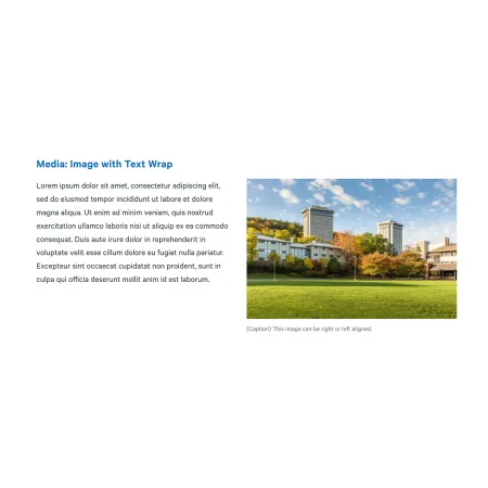
Image with Text Wrap is a layout component that pairs a single image with body text, with the text wrapping around the image rather than sitting fully above or below it. The image can be aligned to the left or right side of the column, and the text fills the remaining space and continues below. This component is an Image with Text Wrap!

This component works best when an image directly supports a passage of text, and the two read better as a unit than as separate elements.

When to use Image with Text Wrap

Good use cases include:

  • Adding an accent image to your content from widen.ithaca.edu.
  • A section of an article illustrated by a relevant image
  • News or blog content where an image adds context without dominating the page
  • Any place a standalone image would feel disconnected from the surrounding copy

Avoid using this component when:

  • Your image is detailed enough that it needs full attention (a standard Image component is better)
  • You have only a sentence or two of text, since the image and text will look mismatched
  • You want the image and text to be equally prominent (consider Split Media Tile or Two Column Text instead)

On smaller screens, the image stacks above the text rather than wrapping. Make sure the image still makes sense in that order.

Adding and Modifying Image with Text Wrap

Heading (optional, 120 character limit): A title that appears above the image and text. Leave this blank if the component sits within a section that already has its own heading.

Image (required): Upload an image from your computer or choose one from the media library. After selecting an image, you will be prompted to fill in alternative text.

Alternative text (required): A short description of the image used by screen readers and displayed when the image fails to load. This is important for accessibility. Describe what the image shows rather than what it represents. For example, "Students walking across the Academic Quad in fall" rather than "Campus life."

Image Position (required): Choose whether the image appears on the Left or Right of the text. Right is the default. Think about which side draws the eye more naturally for your content, and consider alternating positions if you are stacking several of these components in a row.

Caption (optional, 200 character limit): A short line of text that appears directly beneath the image. Supports basic formatting like bold, italics, and links.

Text (required): The body content that wraps around the image. This field supports full rich text editing, including bold, italics, links, lists, and tables. Longer text wraps below the image as needed. Very short text may leave the image looking unbalanced against the surrounding white space.

Text format: Both rich text fields default to Basic HTML, which covers what most editors need. Leave this setting as-is.

SUPPORTED CONTENT TYPES:

  • Topics,
  • pages,
  • blog posts,
  • IC View articles,
  • Intercom posts,
  • profiles,
  • person spotlights,
  • and news articles.
Need help with the rich text editor?

The Text field in this component uses the same rich text editor as the standard Text component. For a full breakdown of formatting options, paragraph styles, links, and tables, visit the Text component page.

Just need an image on its own?

If your image does not need accompanying body text, or you want it to stand on its own at full width, the standard Image component is a better fit. It also supports an expandable view for users who want a closer look.