Visual Brand Application

Learn how to apply our visual brand to capture the purposeful energy and dynamic, student-centered atmosphere that exemplifies the Ithaca College experience.

Visual Brand Personality

IC’s visual brand personality should be used as an internal reference while developing communications. It is built on IC's brand personality and is used to engage with audiences in an authentic and accessible way through purposeful and inspirational designs.

Communicators take the traits of IC's brand personality and apply them to their work. The ideal result is that the audience feels they know and can recognize IC—almost in the same way they’d recognize a friend.

Visual Personality Traits

IC’s brand personality includes two primary traits, each with four supporting traits:

Purposeful (expressing humanity)

  • Genuine
  • Approachable
  • Empowering
  • Dynamic

Inspirational (expressing momentum)

  • Aspiring
  • Engaging
  • Passionate
  • Innovative

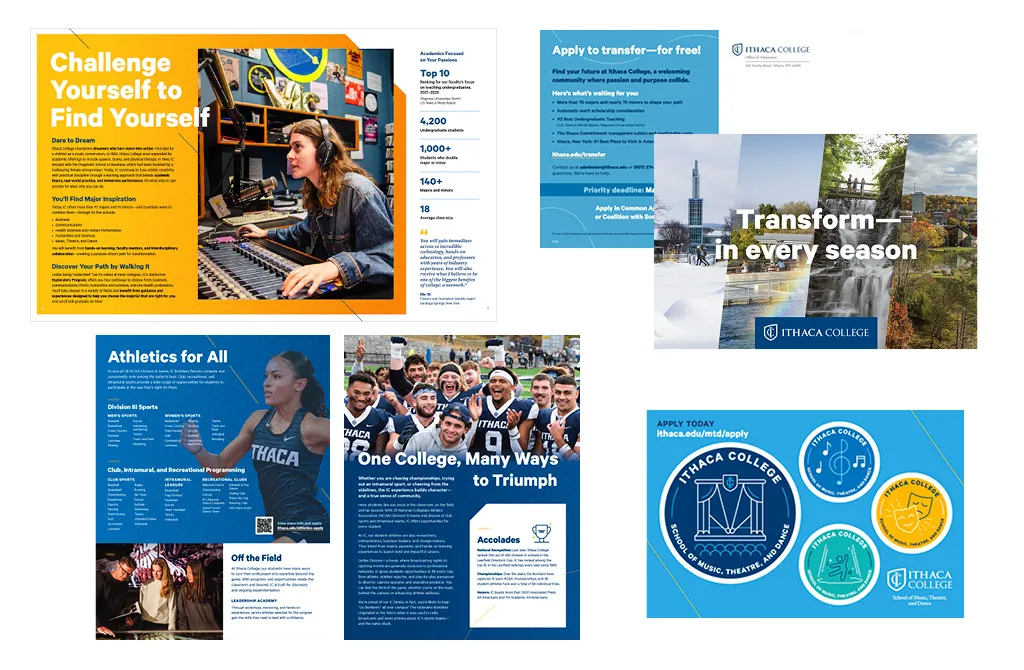
Personality through Visuals

Here are some examples of how these traits might be applied through visuals.

Trait: Purposeful 
Visual Application: Genuine

  • White space
  • Attention to structure and hierarchy
  • Intentional (rather than overwhelming) use of typography and graphic elements

Trait: Inspirational 
Visual Application: Aspiring

  • Bright, bold colors
  • Photography and graphic elements that create a feeling of energy and momentum
  • Visual elements and/or treatments that add interest to engage and inspire the viewer

Applying the Visual Personality

IC’s visual personality creates a common, unifying theme for our brand. This theme is closely tied to our brand and is a succinct way to align the brand expression.

The visual personality is especially helpful for high-impact deliverables where one of the main goals is for the viewer to feel and perceive the distinguishing aspects of IC in conjunction with brand messaging (for example, videos for prospective students, viewbooks, and storytelling deliverables).

There are two visual qualities that form the brand personality, the backbone of IC’s visual brand style:

Humanity

  • IC’s visual language should feel human—warm, personal, and unique.
  • Our messaging is for people and about people.
  • IC’s people and the feeling of our community are among our most distinctive qualities.

Momentum

  • IC’s visual language should express a dynamic feeling of direction and energy.
  • The purpose is movement—to change and transform.
  • People of IC are in motion, working with momentum.

Below are some graphic elements tied to the IC brand that are in Canva and available to help express the traits of the brand personality and how to use them.

Graphic Elements

Graphic elements embody the feeling of momentum, moving in a direction with energy and focus.

Lines are leaders on a mission.

They work best when they have a strong sense of direction and/or call out a focal point of a photo or design. Use lines to create focused momentum and motion. They should always follow a clear, dynamic path and never overwhelm the content but enhance or point to it. There are three types of lines—diagonals, fluid, and arcs.

Tips for use: 

  • Maintain the integrity of the lines by scaling proportionally.
  • Make sure fluid lines are geometric (not organic) in form.
  • Keep lines thin—around 1 point in print, depending on the size of the deliverable. (Lines that are too thick are too visually heavy, distracting, and feel less sophisticated.)
  • Sweep lines across a layout to create a feeling of momentum.
  • Continue the lines to the edge of the design piece to create a sense of movement across the page.
  • Choose one or two confident lines to build a feeling of focused energy. (Too many lines or competing lines can make a design feel cluttered. If more energy or impact is needed, consider using pattern, color, and/or shape instead.)

Patterns feel eclectic, playful, and energetic.

Patterns help create a sense of momentum and energy. Use patterns in smaller areas or as detail to add texture to a photo or design. Patterns are community and humanity oriented. Bold, geometric, and unified movement adds a friendly tone to solid backgrounds.

Tips for use:

  • Use patterns over shapes or solid color to create a feeling of layering or depth.
  • Integrate patterns in photo grids to add energy and visual interest.
  • Pair patterns with bold headlines for visual impact.
  • Use patterns selectively to create focused energy. (Don’t overwhelm a design with patterns.)

Shapes create direction and impact with bold areas of color.

Use shapes to create dynamic compositions, guide the viewer’s eye, and convey visual energy and impact. When combined with photography, shapes can amplify the energy of a moment. Shapes can also create a feeling of layering and depth.

Tips for use:

  • Make sure shapes (curves in particular) are geometric—not free-flowing or organic. (Examples are a cropped circle, an arc, etc.)
  • Maintain the integrity of the shapes by scaling proportionally.
  • Add textures into shapes. (This is a good way to integrate the shape into a layout.)

Texture can help give designs a tactile and warm feeling. 

Adding texture to areas of solid color balances the graphic elements so that designs feel both dynamic and human. When using texture, always create a gradient—from dense grain to minimal grain. Gradients of texture feel more dynamic than flat color. You can create monochromatic or two-color gradients depending on what works best for the deliverable.

Tips for use:

  • Always use subtle grain texture—nothing with a heavy grunge.
    • Please note that texture files are set at specific sizes. Do not scale up in large amounts as this creates a heavier grunge effect. Use a larger file size and always scale down.
  • Add warmth and visual interest to large blocks of color with texture, if needed. (Decide what works best based on the tone and content of the piece being made.)
  • Add texture at an angle or to a shape to help create a sense of movement and momentum.
  • Use texture to soften floods of color when one solid color may be too visually dominant.

Icons help the viewer absorb and process information, adding personality and visual interest to a design. 

The style of our brand icons strikes a balance between practical/informative and playful/warm. The hybrid, geometric-organic line art style is crisp and clear, and it works well to bring attention to stats and important content. The rounded, friendly feel and playful elements showcase IC’s personality.

Tips for use:

  • Use icons to help make content easy to scan or to reinforce content. (For example, a science-related icon near a scientific stat in a recruitment piece may catch the eye of a student interested in a science major.)
  • Don’t overwhelm the content with too many icons. (They should be visual guideposts and not create visual noise.)
  • Add icons for visual interest when photo assets are lacking.
  • Use icons to help deliver information for a wide range of products, such as stickers, apparel, and other assets.
  • Limit colors to two per icon. (This simplicity helps to keep them clearer when used in larger designs.)
  • Don’t resize any icons beyond 10% of their intended size. Icons should take no more than 20% of the space of the entire design.
  • Make sure that all icons are the same size throughout the piece.

Graphic Elements Design Tips

Feel free to contact Marketing Communications for help or advice with any of these design elements. All of these elements can be used to build communications pieces through Canva or with help from our department. Advanced users who have access to Adobe can contact us for access to these elements in the Adobe Library.  

Do

  • Use graphic elements purposefully. Consider the goals of the design and what needs to be expressed.
  • Assume intelligence and maturity in the audience. Be sure to balance playfulness and energy with simplicity and sophistication.
  • Use graphic elements with the motif in mind, balancing humanity and momentum.
  • Create hierarchy with graphic elements and text. Imagine a volume knob for each element in a piece and make sure that all of the elements aren’t turned up to max.

Don’t

  • Don't overwhelm with graphic elements. They should always support the message rather than distract from it.
  • Don't use graphic elements the same way for every piece. Remember to consider tone, audience, and message, adjusting your approach accordingly.
  • Don't overdo it. Keep things simple, bold, and confident.