Featured Events

Highlights a selection of upcoming events.

Understanding Featured Events

Example of the "Featured Events" component / paragraph

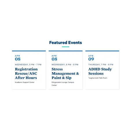
Featured Events displays a short list of upcoming campus events, pulled automatically from approved event feeds. You choose which events to highlight by name, and the component builds each event card for you, including the date, day and time, event title, and location. You do not type any of those details yourself. On the published page, events appear as clean, linked cards beneath your heading.

When to use Featured Events

Reach for Featured Events when you want to point visitors toward specific upcoming happenings that are already listed in a campus calendar feed. Good use cases include:

  • A department page spotlighting its own upcoming lectures, recitals, or info sessions
  • An athletics or program page highlighting the next few games or events
  • A profile page showing events a faculty or staff member is involved with
  • Any page where you want to surface a handful of timely, date-driven events without maintaining them by hand

Avoid using Featured Events for content that is not a real, scheduled event in one of the approved feeds, since only events from those feeds can be added. If you want to highlight news or stories instead of events, the Collection: ICView & News or Feed: Latest News components are usually a better fit.

Where events come from

You cannot type in a custom event. The events available to you are drawn from a set of approved feeds:

  • Sidearm, for athletics and sports events
  • Engage, for student organization activities
  • The School of Music, Theatre, and Dance, for Music Department events
  • Select campus events added by the marketing team

As you type into the event field, only events from these sources will appear as options to select.

How the feed displays and updates

A few behaviors are handled automatically, so it helps to know what to expect:

  • You can preload as many upcoming events as you like, but only three will display on the published page at a time.
  • After an event occurs, it automatically disappears from the feed, so the list stays current without any editing on your part.
  • Events scheduled more than 100 days out will not appear as selectable options until they are within the 100-day window.
  • If there are no upcoming events to show, the entire component becomes invisible on the published page, including the heading, subheading, and link. Nothing empty is left behind.

Adding and modifying Featured Events

Section Heading (optional)

The Section Heading is the title that appears above the event cards. It comes pre-filled with "Featured Events," but you can change it to something more specific, such as "Upcoming Recitals" or "This Week in Bombers Athletics." It has a 60 character limit, which keeps headings short and scannable.

Section Subheading (optional)

The Section Subheading is an optional line of supporting text that appears beneath the heading. Use it to add brief context, such as a date range or a short invitation to attend. It has a 130 character limit. Leave it blank if the heading already says enough.

Both the Section Heading and Section Subheading support light formatting. For the full list of options, see the Text component.

Event (required)

The Event field is where you choose the events to feature. Start typing the name of an event, and matching results from the approved feeds will appear in a dropdown. Select the one you want. Remember that only events within the next 100 days are selectable, and that just three will show on the published page at a time.

To add more events, click "Add another item" beneath the event field. You can preload as many as you like. To reorder them, use the drag handle on the left side of each event block and drag it into the position you want. The order you set determines which events show first.

More Link (optional)

The More Link adds an optional link beneath the events, typically pointing visitors to a full calendar or events listing.

  • URL: Start typing the title of a piece of content to select it, or enter an internal path such as /node/add or an external URL such as https://example.com. For help with the different link types, including front-page and button-style links, see {LINK TO (Working with Links)}.
  • Link text: The words shown on the link. Keep it short and action-oriented, for example "View All Events." On the published page, this renders as a button below the event cards.

Leave the More Link blank if you do not need to send visitors anywhere beyond the featured events.

Supported content types:

  • news articles,
  • sites,
  • topics,
  • profiles,
  • academic programs,
  • academic departments,
  • and pages.