Feed: Latest News

Displays a feed of the most recent news articles.

Understanding Feed: Latest News

Example of the "Feed: Latest News" paragraph / component

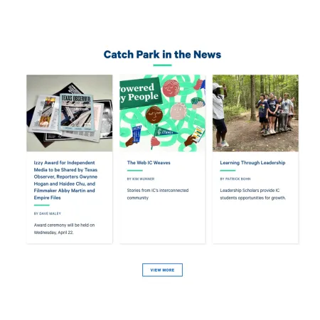
Feed: Latest News automatically displays the three most recent news articles for a topic you choose. Each article appears as a card with its image, headline, author, and a short summary. Because the feed updates itself as new articles are published, you do not have to add or swap out content by hand.

When to use Feed: Latest News

Reach for Feed: Latest News when you want part of a page to stay current with the latest IC News coverage on a particular subject. Good use cases include:

  • Showing recent news on a School or Initiative level
  • Keeping a topic page tied to its latest related coverage
  • Surfacing recent announcements on a custom landing page
     

Avoid using Feed: Latest News when you want to feature specific, hand-picked articles or control the exact order they appear. The feed always shows the three most recent items for the topic and cannot be curated, unlike Collection: IC View & News. If you want to highlight blog posts instead of news articles, the Feed: Recent Blogs component is usually a better fit. If you only need to point readers to a single article, a standard Text component with a hyperlink is simpler.

Adding and modifying Feed: Latest News

Collection Heading (optional)

The Collection Heading is the title displayed above the feed, such as "Catch Park in the News." Use it to tell readers what the section is about. Leave it blank if the surrounding content already makes the purpose clear. The heading is limited to 60 characters for readability.

Collection Intro Text (optional)

The Collection Intro Text is a short line of supporting text that appears beneath the heading. Use it to give readers a bit of context for the feed, for example the kind of stories they can expect to see. It is limited to 130 characters. Leave it blank if the heading alone is enough.

News Topic (required)

The News Topic field controls which news articles appear in the feed. Start typing the name of a topic and select it from the list that appears. You can choose one topic only. The component then displays the three most recent news articles tagged with that topic. Because this field is required, the feed will not display until a topic is selected.

Learn More Link (optional)

The Learn More Link adds a button beneath the feed, shown as "View More" in the example, that sends readers to a page with more articles. It has two parts:

  • URL: Where the button points. Start typing the title of a piece of content to select it, or enter an internal path such as /news or an external URL. For more on choosing a destination, see Working with Links.
  • Link text: The words shown on the button itself, such as "View More" or "See All News."

If you leave the Learn More Link blank, no button appears.

Supported content types:

  • sites,
  • academic programs,
  • academic departments,
  • topics,
  • custom landing pages,
  • and profiles.
Looking for a demo of Feed: Latest News?

The "Feed: Latest News" component is not currently on the Content Demo. Check back soon for updates!