Status message

Media: Gallery

Grid showcase of images and videos.

Understanding the Media: Gallery component

Example image of the "Media: Gallery" paragraph / component

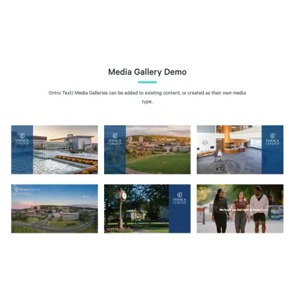
The Media: Gallery component displays a collection of images and videos together in a single grid. Visitors see all of the items at once and can click any one to view it at full size. It is built for showing several related pieces of media as a set, rather than presenting one image or one video on its own.

When to use the Media: Gallery component

Reach for the Media: Gallery when you have a group of images or videos that belong together and are best viewed as a collection. Good use cases include:

  • Photos from a campus event, such as Commencement or Move-In Day
  • A set of images documenting a student project, performance, or research trip
  • A mix of short videos and photos that tell one story
  • A department or program showcasing its facilities, studios, or labs

Avoid using the Media: Gallery for a single piece of media. If you only have one image or one video, the Media: Image or Media: Video Embed component is usually a better fit. If each image needs a lot of surrounding explanation, a series of Media: Image with Text Wrap components will read more clearly than a grid.

Adding and modifying the Media: Gallery component

The Media: Gallery component has two parts: a short line of intro text, and the media items themselves.

Media Gallery Intro Text (optional)

The Media Gallery Intro Text is a short line of text that appears above the gallery grid. Use it to give the collection a quick label, such as "Commencement 2026" or "Inside the Studio." This field is limited to 30 characters, so it works as a brief label rather than a full sentence. Leave it blank if the surrounding content already makes clear what the gallery shows.

Media Items (required)

The Media Items field holds the images and videos that make up the gallery. Every gallery must have at least one item. To add a piece of media, click "Add Media" inside the Media Items box. A window opens with two tabs, "Images" and "Video," so you can add either type of media. See the sections below for how each one works.

To add photos, open the "Add Media" window and stay on the "Images" tab. Drag one or more image files into the upload area, or click it to browse your computer. You can add several images at once.

After each image uploads, a set of fields appears for it:

  • Alternative text (required): A short description of the image, used by screen readers and shown when the image cannot load. Every image needs alt text. See {LINK TO (Working with Images)} for guidance on writing it well.
  • Title (optional): A short title for the image, limited to 30 characters.
  • Photo Credit (optional): The name of the photographer or source, limited to 50 characters.
  • Caption (optional): A short description shown with the image. This field supports rich text editing; see the {LINK TO (Text)} component for the full list of formatting options. The caption is limited to 200 characters.

When you have filled in the fields for your image or images, click "Save" to add them to the gallery.

To add a video, open the "Add Media" window and click the "Video" tab. Videos are added by link rather than by file upload:

  • Video Url (required): Paste the web address of the video. The gallery supports videos hosted on YouTube and Vimeo.
  • Title (optional): A short title for the video, limited to 30 characters.
  • Caption (optional): A short description shown with the video. This field supports rich text editing; see the {LINK TO (Text)} component for formatting options. The caption is limited to 200 characters.

Click "Save" to add the video to the gallery.

Changing Gallery Layout

The gallery arranges your media into a grid automatically, and the order of the items controls how that grid is laid out. Once you have added media, each item appears as a thumbnail inside the Media Items box.

To change the order, click and drag any thumbnail to a new position. The first item appears at the start of the grid, and the rest follow in the order shown. To make changes to an item you have already added, click the pencil icon on its thumbnail to reopen its fields.

Supported content types:

The Media: Gallery component is available on:

  • topics,
  • custom landing pages,
  • profiles,
  • and Media Gallery pages.
Looking for a demo of the Media: Gallery?

This component isn't available on standard pages. See it in context on the Media Gallery Demo page.