Split Media Tile

Understanding the Split Media Tile component

Visual example of the Split Media Tile component/paragraph

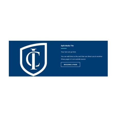
The Split Media Tile pairs an image on one side with a heading, body text, and an optional button on the other, displayed as a single bold tile across the page. It is a media-forward way to draw attention to one specific piece of content, like a featured story, program, or call to action.

When to use a Split Media Tile

Reach for the Split Media Tile when you want to spotlight one item with both visual and written impact. Good use cases include:

  • A featured announcement or initiative on a department or academic program landing page
  • Promoting a single program, event, or news story with a strong visual hook
  • Directing readers to another page on ithaca.edu or an external source through a button
  • Highlighting a Person Spotlight or IC News story on a topic page

Avoid using a Split Media Tile when you need to present several similar items together. If you have multiple cards that should sit side by side, the Collection: Card Grid is usually a better fit. If you want body text with an image flowing alongside it, the Media: Image with Text Wrap is built for that. If you only need a standalone button, use the Standalone CTA Button.

Adding and modifying Split Media Tiles

Style (required)

The Style dropdown sets the overall color treatment of the tile. It controls the background color of the tile and the color of the text inside it. Two options are available to all editors:

  • Blue Dark: A dark blue background with white heading and body text. Use this when you want the tile to stand out boldly against the surrounding page.
  • White: A white background with dark text. Use this when you want a quieter, lower-contrast tile that blends more gently into the page.

Pick the option that fits the visual rhythm of the page around it.

Heading (required)

The Heading is the bold title that appears at the top of the tile's text side. It supports up to 40 characters, for the best support on smaller screens.

Keep the heading short and direct. Examples: "Apply by March 1," "Meet Our Faculty," "Read the Full Story."

Text (required)

The Text field is the body content that appears below the heading. Use it to give the reader one or two sentences of context about what the tile is promoting and why they should click through.

The Text field supports rich text editing. See the Text component for the full list of formatting options. There is a hard character limit of 255 characters.

Link (optional)

The Link section adds a button at the bottom of the tile. If you do not add a link, no button appears, and the tile is presented as image and text only. If you want a button, both fields below are required.

  • URL (required): Start typing the title of the page you want to link to and choose it from the autocomplete suggestions. You can also paste an external URL (like https://example.com) or enter an internal path (like /node/add). For more on link behavior, see Working with Links.
  • Link text (required): The text that appears on the button itself. Keep it short and action-oriented, like "Building a Page," "Apply Now," or "Read More."

Image (required)

The Image sits opposite the text and is the visual anchor of the tile. Upload a new image or choose one from the media library. For guidance on sizing, cropping, and choosing the right image, see Working with Images.

  • Alternative text (required): A short description of the image used by screen readers and shown if the image fails to load. Describe what the image shows, not what it is. For example, "Students working in a music recording studio" is better than "A photo."
  • Photo Credit (optional): Credit the photographer or source of the image when needed. Supports up to 50 characters.

Supported content types:

  • sites,
  • topics,
  • pages,
  • academic programs,
  • academic departments,
  • blog posts,
  • custom landing pages,
  • news articles,
  • and person spotlights.
Split Media Tile Example

An example of the Split Media Tile can be found in the Web Content Demo.