Hero: Video Modal

A hero banner that launches a video in a popup.

Understanding the Hero: Video Modal component

Example of the "Hero: Video Modal" component, showing a demo image of the Park Cafe

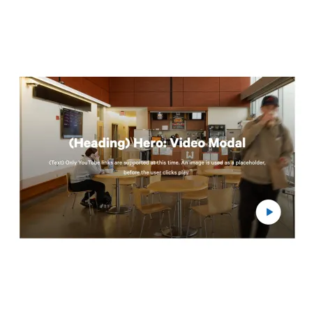
The Hero: Video Modal is a full-width banner that sits at the top of a section or page. It displays a large background image with a heading, an optional line of text, and a play button. When a visitor clicks the play button, the video opens in a popup (a "modal") and begins playing, without sending the visitor away from the page.

When to use the Hero: Video Modal

Reach for this component when you want a video to be the centerpiece of a page, but you do not want it to play until the visitor chooses to watch it.

Good use cases include:

  • The top of a program or department landing page introduced by a welcome or overview video
  • A Person Spotlight where the subject tells their story on camera
  • An IC News feature anchored by a short documentary-style clip
  • A campaign or custom landing page where a single video carries the message


Avoid using this component when the video does not need a prominent, banner-style introduction. If you simply want to place a video within the body of a page, the Media: Video Embed component is usually a better fit. If you want a video promoted next to a block of text rather than as a full-width banner, consider the Video Content Tile component. And if you want a banner with no video at all, the Hero: Overlay component is the better choice.

How the video and image work together

The Image you upload is not the video itself. It acts as a thumbnail, the still picture a visitor sees in the banner before anything plays. The play button is layered on top of that image. When the visitor clicks it, the popup opens and plays the Video you selected. Because of this, both the Image and the Video are required, and it helps to choose an image that previews the video well, such as a frame from the video or a related photo.

Adding and modifying the Hero: Video Modal

Heading (required)

The Heading is the large title displayed over the banner image. Use it to tell visitors what the video is about in a few words, for example "Meet the Class of 2026" or "A Day in the School of Business." The Heading is limited to 60 characters, so keep it short and direct. A length of roughly three to six words works best.

Text (optional)

The Text field is a short line of supporting copy that appears beneath the heading. Use it to add a sentence of context that the heading alone does not provide. Leave it blank if the heading is already clear on its own. This field is limited to 180 characters. It supports rich text editing; see the Text component for the full list of formatting options.

Video (required)

The Video is the clip that plays inside the popup when a visitor clicks the play button. You can select one video. Choose an existing video from the media library, or add a new one from YouTube or Vimeo. For step-by-step instructions on adding a video, see the Media: Video Embed component.

Image (required)

The Image is the still picture shown in the banner before the video plays, and it serves as the visual backdrop for the heading and play button. Upload an image from your computer or choose one from the media library. After selecting an image, you will be prompted to fill in alternative text.

Alternative text (required)

The Alternative text is a short description of the image used by screen readers and shown if the image fails to load. This is important for accessibility. Describe what the image shows rather than what it represents, for example "Students seated around tables in the campus cafe" rather than "Student life."

Supported content types:

  • sites,
  • topics,
  • academic programs,
  • academic departments,
  • custom landing pages,
  • news articles,
  • and person spotlights.
Looking for an example?

This component isn't available on standard pages. See it in context on the Topic Demo page of the Web Content Demo.