Video Content Tile

Promote a video and custom thumbnail, with accompanying text.

Understanding Video Content Tiles

Example of the Video Content Tile paragraph / component

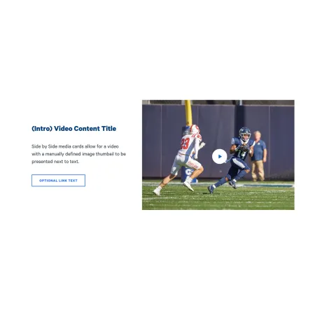
The Video Content Tile pairs a video with a short block of text, side by side, so the two read together as a single promotional unit. You choose a custom thumbnail image that shows before the user plays the video, write a short title and description next to it, and add an optional link that sends readers to a related page. It is a good way to feature one video without it taking over the whole page.

When to use a Video Content Tile

Reach for a Video Content Tile when you have one video you want to spotlight alongside a brief, focused pitch. Good use cases include:

  • Featuring a program or recruitment video next to a short description and an "Apply now" link
  • Promoting a recorded lecture, webinar, or event recap with a sentence of context
  • Highlighting a department or campus-life video with a link to learn more
  • Pairing an admissions video with a clear next step for prospective students

Avoid using a Video Content Tile when the video does not need any surrounding text or card framing. If you just want a video on its own in the flow of a page, the Media: Video Embed component is usually a better fit. If your content is image-led rather than video-led, consider the Split Media Tile or Promo Tile instead. If you want a video to open full-screen as a page banner, the Hero: Video Modal is the better choice.

How the media and text sit together

The Media Position field controls whether the video and thumbnail appear to the left or right of your text. On smaller screens, the media and text stack vertically rather than sitting side by side, so make sure your title and description still make sense when read above or below the video.

Adding and modifying Video Content Tiles

Media Position (required)

The Media Position setting is a dropdown that controls which side of the tile the video appears on. Choose Left or Right ; Right is the default. If you are stacking several of these tiles in a row, consider alternating the position to keep the layout from feeling repetitive.

Image (required)

The Image is the custom thumbnail that displays before the video is played, and it can also serve as the main media for the tile. Upload an image from your computer or choose one from the media library. This is your chance to pick a clear, appealing still rather than relying on whatever frame the video defaults to.

Alternative text (required)

The Alternative text is a short description of the image used by screen readers and shown if the image fails to load. This is important for accessibility. Describe what the image shows rather than what it represents, for example "Two field hockey players competing for the ball during a game" rather than "Athletics."

Photo Credit (optional)

The Photo Credit is a short line crediting the source or photographer of the thumbnail image. It is limited to 50 characters, so keep it to a name or short attribution.

Video (required)

The Video is the clip that plays when a reader interacts with the tile. Adding a video uses the same prompt as the Media: Video Embed component, so see that page for the full steps on selecting or embedding your video.

Title (required)

The Title is the short heading that appears next to the video. It is limited to 60 characters, with 3 to 7 words recommended (one to two lines, and no more than three). Keep it punchy and specific, for example "Inside the Park School" or "A day in the life at IC."

Description (optional)

The Description is the body text that appears beneath the title, next to the video. It is limited to 255 characters, with roughly 24 to 54 words recommended. Use it to give readers just enough context to want to watch or click through. The Description field supports rich text editing; see the Text component for the full list of formatting options.

Link (optional)

The Link turns the tile into a path to more content. Leave it blank if the video stands on its own. If you add a link, two fields apply:

  • URL (required when a link is used): Start typing the title of a page on ithaca.edu to select it, or paste an internal path or an external address such as https://example.com.
  • Link text (required when a link is used): The clickable label readers see, for example "Watch the full story" or "Learn more about the program." Write text that describes where the link goes rather than a generic "Click here."

For more on building links, see the Working with Links guide.

Supported content types:

  • sites,
  • topics,
  • pages,
  • academic programs,
  • academic departments,
  • blog posts,
  • and custom landing pages.
Looking for an example?

An example of the Video Content Tile will be live on this page soon. In the meantime, you can see it in context on the Topic Demo of the Web Content Demo.