Cards and Card Collections

Compact, uniform blocks of content that work together in a grid.

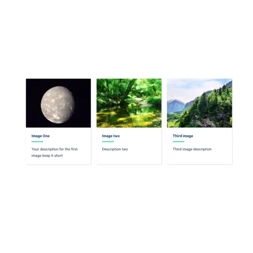
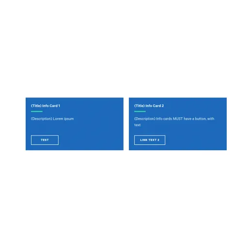
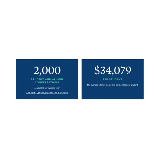
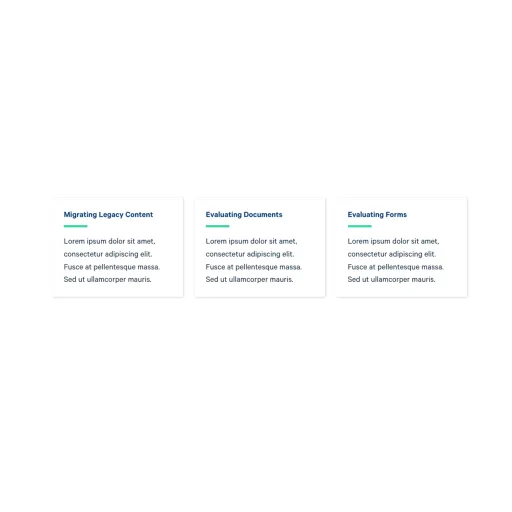
A card is a small, self-contained block that presents one piece of content in a consistent, repeatable shape. Cards are never added on their own. Instead they live inside the "Collection: Card Grid" component, which groups up to three cards of the same type together and gives the group an optional heading. You choose the card type that fits your content, add up to three cards to the collection, and the collection handles the layout.

Cards are built to sit side by side, so they work best when you have a few parallel items that should be read at a glance, such as a set of program highlights, key statistics, or quick links. Because every card in a group shares the same size and styling, a row of cards stays tidy and easy to scan no matter what each one contains.

Adding a heading above a collection

A collection can display an optional heading and subheading above the row of cards, styled to match the Section Heading component at Section Heading. Use it to label a group of cards, for example "Why Choose Ithaca" above three program highlights. If you leave the heading empty, the cards display on their own with no label.

How collections stack

When you place two or more collections one after another, they snap together into a continuous grid so the rows line up neatly. If you want a later collection to read as its own separate section, give that collection a heading. The heading creates a visual break and starts a fresh group beneath it.

Supported content types:

  • sites,
  • topics,
  • academic programs,
  • academic departments,
  • custom landing pages,
  • news articles,
  • and pages.