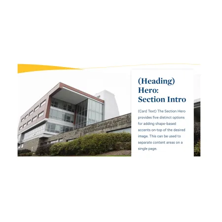
Hero: Section Intro is a full-width banner that pairs a large background image with a colored shape accent and an optional text card. It is designed to introduce a new section of a page or act as a stylized break between content areas, rather than as the main banner at the very top of a page.
When to use Hero: Section Intro
Reach for Hero: Section Intro when you want to visually separate one part of a page from another with a full-width image and a branded shape accent. Good use cases include:
- Marking the start of a new section on a long custom landing page
- Introducing a sub-topic within a site section with a short headline and supporting sentence
- Creating a visual break between content areas on an academic program or department page
- Adding a section banner on a news article that points readers to a related page
Avoid using Hero: Section Intro as the primary banner at the very top of a page. If you need the main top-of-page banner, the Hero: Primary component is usually a better fit. If you simply want a block of body text alongside an image, the Split Media Tile or Media: Image with Text Wrap component is usually a better fit.
Using the component without a card
Every part of the text card is optional. If you leave the card heading, card text, and link blank, the component displays as a styled image with a shape accent and no card. This works well as a simple section divider or page break when you only need the visual treatment.